
wireframe-sketch
v1.0.0Wireframe sketch Skill - Generate hand-drawn style SVG wireframes with sketchy aesthetics. Includes validation rules to prevent layout overlap and ensure proper element spacing.
Wireframe Sketch
Generate hand-drawn style SVG wireframes with a sketchy, professional aesthetic.
Overview
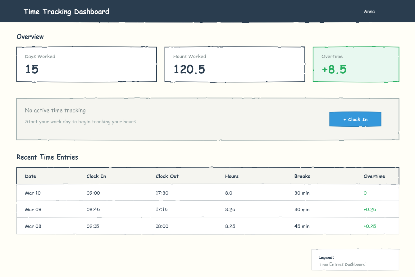
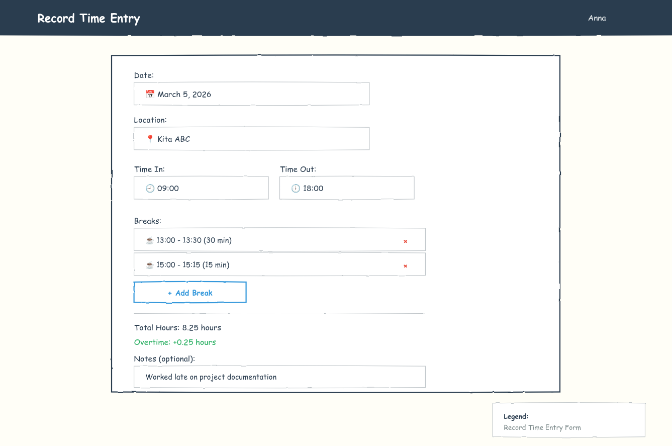
Wireframe Sketch creates visual mockups as SVG images with a hand-drawn, sketchy appearance. Unlike ASCII mockups which use text characters, wireframes are actual graphics that render in the browser — providing a more polished, stakeholder-friendly presentation directly on your prooph board canvas.
This skill teaches AI agents how to generate valid SVG wireframes with proper layout, spacing, and visual hierarchy for UI elements in your Event Models.
Pros and Cons
Advantages
- Professional appearance — Hand-drawn style wireframes look polished and approachable, making them ideal for presentations to non-technical stakeholders, clients, or design reviews.
- Visual clarity — SVG wireframes show layout, spacing, colors, and typography exactly as intended. No ambiguity from text-based representations.
- Rich visual language — Use colors for states (success, warning, error), varied button styles, icons, and proper visual hierarchy to communicate design intent clearly.
- Renders inline — SVGs display directly in prooph board when uploaded as UI element attachments, visible alongside your model.
Disadvantages
- Higher token cost — SVG wireframes consume significantly more tokens than ASCII mockups. A single wireframe can use 500-2000+ tokens depending on complexity. Use them strategically when visual fidelity matters.
- More complex to generate — Requires careful calculation of coordinates, spacing, and validation to ensure the SVG renders without errors. AI agents must follow strict encoding rules.
- Not editable on canvas — Unlike ASCII mockups (plain text), SVG wireframes cannot be edited directly on the prooph board canvas. Changes require regenerating and re-uploading the file.
When to Use
| ✅ Use Wireframe Sketch | ❌ Use Alternatives |
|---|---|
| Presenting to non-technical stakeholders or clients | Quick iteration during early modeling sessions |
| Design reviews requiring visual polish | Token budget is limited |
| Complex layouts where spatial relationships matter | Simple state documentation for developers |
| Final documentation for handoff to UI developers | Internal technical discussions |
Comparison: Wireframe vs ASCII Mockup
| Feature | Wireframe Sketch | ASCII Mockup |
|---|---|---|
| Appearance | Professional, hand-drawn style | Technical, text-based |
| Token cost | High (500-2000+ tokens) | Low (50-200 tokens) |
| Editability | Regenerate and re-upload | Edit directly on canvas |
| Best for | Stakeholders, design reviews | Developers, quick documentation |
| Visual detail | Colors, typography, spacing | Basic layout structure |
| File format | SVG image | Plain text code block |
Usage
Once installed, your AI agent will know how to generate SVG wireframes for UI elements. The wireframes are created on-the-fly during event modeling sessions and uploaded directly to UI elements — no files saved to disk.
Examples
Example Output
A wireframe includes:
- Warm paper-tone background (
#FFFEF7) - Sketchy filter for hand-drawn edges
- Comic Sans MS font for informal, approachable text
- Proper spacing and visual hierarchy
- Legend identifying the wireframe
<svg xmlns="http://www.w3.org/2000/svg" viewBox="0 0 1200 800">
  <defs>
    <filter id="sketchy">
      <feTurbulence type="fractalNoise" baseFrequency="0.04" numOctaves="3"/>
      <feDisplacementMap in="SourceGraphic" in2="noise" scale="2"/>
    </filter>
  </defs>

  <!-- Background -->
  <rect width="1200" height="800" fill="#FFFEF7"/>

  <!-- Content with sketchy shapes -->
  <path d="M48 120 Q600 118 1152 120..." filter="url(#sketchy)"/>
  <text x="68" y="180" font-family="Comic Sans MS, cursive, sans-serif">Dashboard</text>
</svg>
| name | wireframe-sketch |
|---|---|
| description | Generate hand-drawn style SVG wireframes with sketchy aesthetics. Includes validation rules to prevent layout overlap and ensure proper element spacing. |
Wireframe Sketch Skill
Generate SVG wireframes with a hand-drawn, sketchy aesthetic while maintaining proper layout structure and element spacing.
Style Guidelines
Visual Aesthetic
- Use sketchy filter for rough, hand-drawn edges:
<filter id="sketchy" x="-5%" y="-5%" width="110%" height="110%"> <feTurbulence type="fractalNoise" baseFrequency="0.04" numOctaves="3" result="noise"/> <feDisplacementMap in="SourceGraphic" in2="noise" scale="2" xChannelSelector="R" yChannelSelector="G"/> </filter> - Background:
#FFFEF7(warm paper tone) - Primary stroke:
#2C3E50(dark ink) - Secondary strokes:
#7F8C8D,#95A5A6 - Use quadratic curves (
Q) instead of straight lines for boxes - Apply
filter="url(#sketchy)"to shapes (not text)
Typography
- Font family:
Comic Sans MS, cursive, sans-serif - Headers: 18-24px, weight 600
- Body text: 13-15px, weight 400-500
- Labels: 12-14px, weight 500
- Use appropriate colors for emphasis:
#2C3E50,#34495E,#7F8C8D
SVG Encoding Rules (CRITICAL)
The SVG MUST be valid XML that renders without errors in a browser. Before outputting SVG:
Hex colors must be valid: Only use digits
0-9and lettersA-F(case-insensitive).- ✅ Correct:
#2C3E50,#FFFEF7,#3498DB - ❌ Invalid:
#2C3H50(H is not valid),#3498DB120.5(truncated/corrupted)
- ✅ Correct:
Font family must be exact: Always use
Comic Sans MS, cursive, sans-serif- ✅ Correct:
font-family="Comic Sans MS, cursive, sans-serif" - ❌ Invalid:
font-family="Comic Sans M3, cursive"(typo: M3 instead of MS)
- ✅ Correct:
No control characters: Only printable characters, newlines, and tabs in text content
- Avoid Unicode replacement character `` or
\ufffd - Avoid null bytes, bell, backspace, etc.
- Avoid Unicode replacement character `` or
All XML tags must be closed: Every opening tag needs a closing tag or self-closing
/>- ✅ Correct:
<text>...</text>,<rect ... />,<path ... /> - ❌ Invalid:
<text>Hellowithout closing
- ✅ Correct:
No truncated values: Ensure color values, coordinates, and text content are complete
- Check that fill/stroke values don't have trailing garbage like
#3498DB120.5 - Verify text content ends cleanly without cut-off characters
- Check that fill/stroke values don't have trailing garbage like
Valid XML structure:
- Must start with
<svg xmlns="http://www.w3.org/2000/svg" ...> - Must end with
</svg> - All attribute values must be properly quoted
- Must start with
Color Palette (Sketchy)
- Success:
#27AE60fill,#E8F8F0background - Warning:
#F39C12fill,#FFF9E6background - Error:
#E74C3Cfill,#FDEDECbackground - Primary/Info:
#3498DBfill,#EBF5FBbackground - Disabled:
#E8E6E3fill,#95A5A6text - Neutral backgrounds:
#F5F5F0,#FFFFFF
Shape Construction
- Rectangles: Use paths with quadratic curves
<path d="M{x} {y} Q{mid_x} {y-2} {x+w} {y+1} L{x+w} {y+h} Q{mid_x} {y+h+2} {x} {y+h-1} Z"/> - Circles: Use irregular paths with 4 control points
<path d="M{cx-r} {cy-r} Q{cx} {cy-r-2} {cx+r} {cy-r+1} Q{cx+r+2} {cy} {cx+r-1} {cy+r} Q{cx} {cy+r+2} {cx-r+1} {cy+r-1} Q{cx-r-2} {cy} {cx-r} {cy-r}"/> - Lines: Use slight curves
M{x1} {y1} Q{mid_x} {mid_y±2} {x2} {y2}
Layout & Spacing Rules
Vertical Spacing
| Element Type | Height | Top Margin | Bottom Margin |
|---|---|---|---|
| Navigation bar | 64px | 0 | 24px |
| Page header (title) | 24px | 0 | 8px |
| Page subtitle | 20px | 0 | 24px |
| Alert/Success banner | 96-120px | 0 | 24px |
| Section header | 24px | 0 | 12px |
| Cards/Containers | Variable | 0 | 24px |
| Buttons | 36-40px | 16px (from text above) | 8px |
| List items | 44-48px | 0 | 0 |
| Input fields | 36-40px | 8px (from label) | 16px |
Horizontal Spacing
- Page margins: 48px from edges
- Card internal padding: 20px
- Button internal padding: 16px horizontal, 8px vertical
- List column gaps: minimum 40px
Text Overflow Prevention (CRITICAL)
All text content must fit within its parent container. Never allow text to extend beyond container boundaries.
Rule: Calculate text width before placing it:
- Approximate character widths for Comic Sans MS at common sizes:
- 12px: ~7px per character (average)
- 14px: ~8px per character (average)
- 16px: ~9px per character (average)
- 18px: ~10px per character (average)
- 32px: ~18px per character (average)
Formula:
available_width = container_width - left_padding - right_padding
text_width = character_count * char_width_at_font_size
if text_width > available_width:
  → reduce font size, shorten text, or expand container
Legend containers: Always size the legend box to fit the longest line of text:
longest_line = max(len("Legend:"), len(legend_description))
legend_width = longest_line * char_width + left_padding + right_padding + buffer (20px)
✅ Correct — legend sized to fit text:
<!-- Text: "Dashboard - Resume Active Tracking" = 37 chars * 7px = ~259px + 40px padding = 299px -->
<path d="M850 720 Q1000 718 1150 720 L1150 780 Q1000 782 850 780 Z" .../>
<text x="870" y="768">Dashboard - Resume Active Tracking</text>
❌ Wrong — text overflows legend:
<!-- Container width: 202px (950 to 1152) -->
<path d="M950 720 Q1106 718 1152 720 L1152 780 ..."/>
<!-- Text needs ~260px but only 162px available (202 - 40 padding) -->
<text x="970" y="768">Dashboard - Resume Active Tracking</text>
Table cells and list columns: Verify each column value fits:
column_width = column_right - column_left - cell_padding
max_text_in_column = max(len(row1), len(row2), ...) * char_width
column_width >= max_text_in_column
Centering Containers (CRITICAL)
When placing a centered container or panel on the page, always calculate coordinates explicitly — do not estimate.
Formula:
container_width = desired width (e.g., 800px)
container_x = (viewBox_width - container_width) / 2   // For 1200px viewBox: (1200 - 800) / 2 = 200
container_right = container_x + container_width        // = 200 + 800 = 1000
center_x = viewBox_width / 2                           // = 600 (for text-anchor="middle")
✅ Correct — centered 800px container on 1200px canvas:
<!-- Container: x=200, width=800, right=1000 -->
<path d="M200 120 Q600 118 1000 120 L1000 600 Q600 602 200 600 Z" .../>
<!-- Text centered at x=600 (viewBox center, NOT container midpoint) -->
<text x="600" y="180" text-anchor="middle">Title</text>
❌ Wrong — right-aligned container (x=400 to x=1200):
<!-- Container starts at 400, ends at 1200 — pushed to the right edge! -->
<path d="M400 120 Q800 118 1200 120 L1200 600 Q800 602 400 600 Z" .../>
<!-- text-anchor="middle" at x=800 centers within a right-biased container -->
<text x="800" y="180" text-anchor="middle">Title</text>
Verification step: After calculating container_x and container_right, confirm:
container_x >= 0                           // Not off left edge
container_right <= viewBox_width           // Not off right edge
container_x == viewBox_width - container_right  // Symmetric margins
Layout Calculation Formula
When placing elements vertically:
next_element_y = current_element_y + current_element_height + spacing_below
Example for alert banner:
Alert starts at y=176
Alert height = 120px (y=176 to y=296)
Next element must start at y >= 296 + 24 = 320
Placing Buttons Inside Alert/Action Containers
When a button is the primary action for an alert, notification, or info container, place it inside the container, right-aligned. The container must be tall enough to hold both the text content and the button side-by-side — think CSS flex with two columns: left column grows (text), right column auto-sizes (button).
Rule: Container height must accommodate the taller of: text content OR button + vertical padding.
container_height = max(text_block_height, button_height) + top_padding + bottom_padding
container_width = full_width
Layout pattern (two-column flex):
┌─────────────────────────────────────────────────────────────┐
│  Alert Title (left-aligned)                    [Button]     │
│  Alert description (left-aligned, wraps)       (right)      │
└─────────────────────────────────────────────────────────────┘
Example — correct placement:
Alert container: y=316, x=48, width=1102
  Alert title: x=68, y=356
  Alert text: x=68, y=388
  Button: x=950, y=356, width=150, height=40  ← right-aligned, same vertical zone as title
Container height: 120px (enough for title + text + padding)
Button positioning inside container:
button_x = container_x + container_width - button_width - right_padding(typically48 + 1102 - 150 - 48 = 952)- Right padding must match left padding: Use the same internal padding value (typically
24px) for both left and right edges of the container.- ❌ Wrong:
button_right = container_right(button touches container edge) - ✅ Correct:
button_right = container_right - padding(e.g.,1100 = 1152 - 52)
- ❌ Wrong:
button_y = container_y + top_padding + (text_title_line_offset)(align with first text line or center vertically)- Button text vertically centered:
button_text_y = button_y + (button_height / 2) + 4
If text content is taller than the button, expand the container height and keep the button aligned with the title (top of the text block):
Container: y=316, height=160 (expanded for multi-line text)
  Title: y=356
  Text line 2: y=388
  Button: y=356 (aligned with title, not pushed down)
When to use this pattern:
- The button is the primary action for the alert/message (e.g., "Clock In" for "No active tracking")
- There is a clear call-to-action relationship between the text and the button
When to place the button below the container instead:
- The button is unrelated to the container content
- The container is a data table or list where actions belong below
- The container already has internal actions (edit/delete buttons per row)
Validation Checklist
BEFORE outputting SVG, verify ALL of the following:
1. No Overlapping Elements
For each pair of consecutive elements in vertical flow:
-
element_A_bottom + required_spacing <= element_B_top - Calculate:
element_bottom = element_top_y + height - Check button positions: text inside buttons must be vertically centered
- Button text Y =
button_top_y + (button_height / 2) + 4
- Button text Y =
- Buttons below containers: button_y must be > container_bottom_y + 20
- Verify button does not overlap or sit inside the container's bottom border
- Calculate:
container_bottom = container_y + container_height, thenbutton_y >= container_bottom + 24
2. Container Bounds
- All elements fit within viewBox (default:
1200 x 800) - No elements extend beyond container boundaries
- Modal dialogs centered:
(1200 - modal_width) / 2 - Centered containers: Verify
container_x == viewBox_width - container_right(symmetric margins)- Example:
x=200, right=1000on 1200px canvas →200 == 1200 - 1000✓ - Counter-example:
x=400, right=1200→400 != 1200 - 1200✗ (right-aligned!)
- Example:
- Text overflow: Verify all text fits within its container:
- Calculate:
available_width = container_width - 2 * padding - Estimate:
text_width = char_count * char_width(use char width table) - Check:
text_width <= available_width - Legend containers: size to fit the longest description line
- Calculate:
3. Button & Text Alignment
- Buttons have minimum 16px padding from text above
- Button height is minimum 36px for comfortable clicking
- Right-aligned buttons inside containers: button_right must be at least
container_right - padding(same padding as left-aligned text)- Check:
button_x + button_width <= container_right - container_padding
- Check:
- Button text is vertically centered:
text_y = button_y + (button_height/2) + 4 - Buttons below containers: Button must be placed at least 24px below the container's bottom edge, never inside the container or overlapping its border
- If adding elements inside a container, increase container height to fit
4. Consistent Spacing
- Section gaps are 24px minimum
- Related elements (label + input) have 8px gap
- Unrelated elements have 16-24px gap
- List items are 44-48px each with consistent spacing
5. Filter Application
-
filter="url(#sketchy)"applied to shapes only, NOT text - Text elements use Comic Sans MS font directly
- Background rectangles NOT filtered (keep clean)
6. Visual Hierarchy
- Headers are larger and bolder than body text
- Primary actions use filled buttons (colored)
- Secondary actions use outlined buttons
- Disabled elements use gray colors and reduced opacity cues
7. SVG Encoding (MUST PASS — upload will be rejected otherwise)
- All hex color values contain ONLY valid hex digits:
0-9,A-F,a-f- Scan every
#followed by 3-8 characters: verify noG-Zorg-z
- Scan every
- Font family is exactly
Comic Sans MS, cursive, sans-serif(NOTComic Sans M3) - No Unicode replacement characters (`` / U+FFFD) in text content
- No control characters (null, bell, backspace) in text content
- All opening tags have matching closing tags or self-closing
/> - No truncated color values (e.g.,
#3498DB120.5should be#3498DB) - Text content ends cleanly without cut-off characters
- SVG starts with
<svg xmlns="http://www.w3.org/2000/svg"and ends with</svg>
Common Mistakes to Avoid
❌ Button overlapping text inside container:
Container: y=176 to y=296 (height 120)
Button placed at: y=254 (INSIDE container, only 8px from text at y=236)
✅ Correct spacing:
Container: y=176 to y=320 (height 144, EXPANDED)
Text at: y=212, y=236
Button at: y=268 (32px gap from text, 36px button height)
Next section starts at: y=344 (24px gap)
❌ Inconsistent list row heights:
Row 1: y=432, height=48
Row 2: y=482, height=44  ← Different!
✅ Consistent list rows:
Row 1: y=432, height=48
Row 2: y=480, height=48  ← Same height
Template Structure
<svg xmlns="http://www.w3.org/2000/svg" viewBox="0 0 1200 800" fill="none">
  <defs>
    <filter id="sketchy" x="-5%" y="-5%" width="110%" height="110%">
      <feTurbulence type="fractalNoise" baseFrequency="0.04" numOctaves="3" result="noise"/>
      <feDisplacementMap in="SourceGraphic" in2="noise" scale="2" xChannelSelector="R" yChannelSelector="G"/>
    </filter>
  </defs>

  <!-- Background -->
  <rect width="1200" height="800" fill="#FFFEF7"/>

  <!-- Navigation -->
  <!-- Main content -->
  <!-- Sections with proper spacing -->
  <!-- Legend -->
</svg>
Output Requirements
- Generate SVG on the fly - do not save to disk; upload directly to the UI element
- Naming:
NN-descriptive-name-sketch.svg(sequential numbering) - Include legend in bottom-right corner identifying the wireframe
- Validate all spacing before uploading
- Test mentally: Walk through Y-coordinates top to bottom, verify no overlaps
Uploading Wireframes to UI Elements
This skill is only used during event modeling sessions to add wireframe sketches to UI elements. Generate SVGs on the fly and upload them directly — do not save to disk.
Workflow
- Identify the target UI element in the prooph board chapter
- Review the slice context: Check Information, Command, and Event elements in the same, previous, or next slice for example data
- Generate the wireframe SVG using this skill's guidelines, incorporating relevant example data from slice elements
- Validate the SVG using the checklist in "SVG Encoding" section above — validation is your responsibility as the caller
- Upload the wireframe using one of the methods below:
Option A: MCP Tool — upload_image (preferred for AI agents)
The MCP tool returns a pre-signed upload URL. You then upload the file directly via HTTP PUT.
Step 1: Call upload_image to get the pre-signed URL:
Parameters:
chapter_id: The chapter IDelement_id: The UI element's ID (must exist before uploading)file_name: A descriptive file name (e.g.,01-seat-limit-notification-sketch.svg)
Response:
{
"success": true,
"upload_url": "https://dmgffkeqfgljebovngkh.supabase.co/storage/v1/upload/sign/...",
"markdown_image": "",
"storage_path": "workspace/chapter/element/123-abc.svg",
"file_size_limit": 5242880
}
Step 2: Upload the file directly to upload_url via HTTP PUT:
curl -X PUT \
  -H "Content-Type: image/svg+xml" \
  --data-binary @path/to/wireframe.svg \
  "<upload_url>"
Step 3: Update the UI element's description with the returned markdown_image value using the update_element_description tool.
Option B: REST API (for scripts)
Endpoint: POST /api/images/upload
Content-Type: multipart/form-data
Form Fields:
chapter_id: The chapter IDelement_id: The UI element's IDfile_name: A descriptive file nameimage: The SVG file
Example:
curl -X POST \
  -H "Authorization: Bearer pb_xxx..." \
  -F "chapter_id=your-chapter-id" \
  -F "element_id=your-element-id" \
  -F "file_name=wireframe-sketch.svg" \
  -F "image=@wireframes/01-seat-limit-notification-sketch.svg;type=image/svg+xml" \
  https://flow.prooph-board.com/api/images/upload
Replacing Existing Wireframes
To update an existing wireframe in a UI element, use the replace_image MCP tool:
Step 1: Call replace_image with the existing markdown reference:
Parameters:
markdown_image_ref: The existing markdown image reference from the element descriptionfile_name: The new SVG file name
Response:
{
"success": true,
"upload_url": "https://...",
"markdown_image": "",
"storage_path": "...new-path...",
"old_storage_path": "...old-path...",
"file_size_limit": 5242880
}
Step 2: Upload the new file to upload_url via HTTP PUT (same as above).
The old image is automatically deleted when replace_image is called.
Important Notes
- Element must exist first: Always create the UI element before uploading the image, so you have a valid
element_idto use in the storage path - Storage path format:
workspace_id/chapter_id/element_id/timestamp-random.svg - Content type: Always use
image/svg+xmlfor SVG wireframes - Max file size: 5 MB
- URL expiry: Pre-signed upload URLs expire after 1 hour
- SVG validation: For MCP uploads, validation is the caller's responsibility (use the SVG Encoding checklist above). The REST API endpoint still validates server-side.
Wireframe Content Checklist
BEFORE uploading, verify the wireframe content:
- Information shown on the wireframe matches example data from Information elements in the same or previous slice
- Form fields correspond to Command element properties in the same slice (if the wireframe represents a form submission)
- Displayed events or status messages align with Event elements in the same or previous slice
- It makes logical sense to show the information on screen or in a form that gets submitted as a command
- No technical implementation details are visible (only business-facing UI)
Troubleshooting: Wireframe Not Showing on Board
When a user reports that a wireframe image is not displayed on the prooph board, follow these steps proactively:
Step 1: Verify the Markdown Image Tag
Use the get_chapter tool to retrieve the chapter containing the UI element. Check the element's description field and verify:
- The markdown image tag is present and correctly formatted:
 - The
storage:prefix is present — if missing, the image URL is not a valid storage reference - The path has 4 segments:
workspace_id/chapter_id/element_id/filename.svg - No extra whitespace or line breaks inside the URL parentheses
If the markdown image tag is missing or malformed, re-upload the image using upload_image and update the description.
Step 2: Download and Validate the SVG
Use the get_storage_image MCP tool to download the image:
{
  "tool": "get_storage_image",
  "arguments": {
    "storage_path": "markdown-images/workspace/chapter/element/filename.svg"
  }
}
Then verify the returned SVG content:
- Check the
data_urlstarts withdata:image/svg+xml;base64, - Decode the base64 and inspect the SVG source:
- Open the decoded SVG in a text editor or parse it
- Look for the encoding errors listed in the "SVG Encoding Rules" section above
- Common issues: invalid hex colors (
#2C3H50), font typos (Comic Sans M3), truncated values, unclosed tags, replacement characters ()
- If the SVG is invalid, regenerate it with correct encoding and use
replace_imageto upload the fixed version
Step 3: If the Image Download Fails
If get_storage_image returns an error:
- 404 / "Image not found": The upload may have failed or the path is wrong. Re-upload using
upload_image - 403 / "Access denied": The API key may not have access to that workspace. Verify workspace membership
Example Troubleshooting Flow
User: "The wireframe isn't showing on the board"
Agent:
1. Call get_chapter to inspect the UI element description
2. Found: description = "" ✓ Tag looks correct
3. Call get_storage_image with storage_path = "markdown-images/ws/chapter/elem/123-abc.svg"
4. Received base64 SVG, decoded it...
5. Found error: fill="#2C3H50" — invalid hex digit 'H'
6. Regenerated SVG with correct color #2C3E50
7. Call replace_image with the fixed SVG
8. ✅ Image should now display correctly